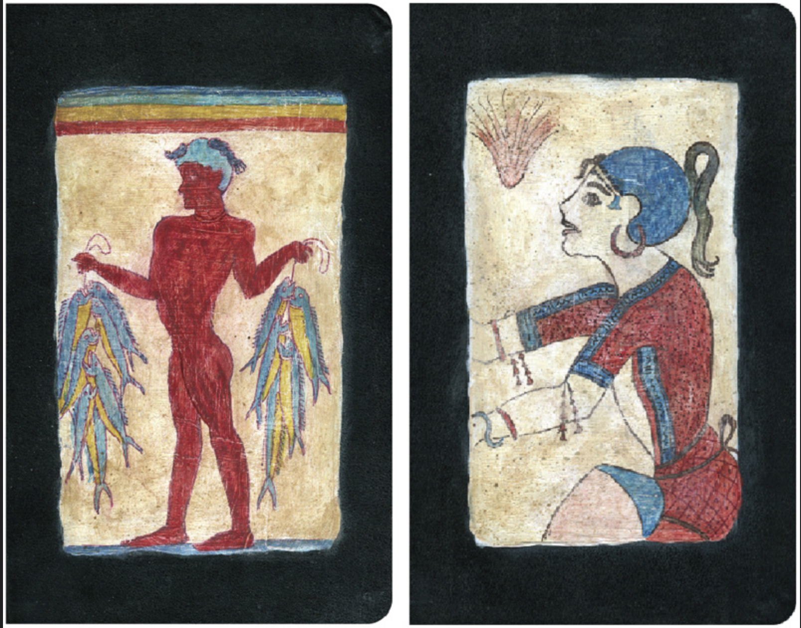
Color is as important to me as are the lines drawn on the page: it’s what gives a sketch its mood. Over the years, I’ve refined my palette by filling my paint box with the colors most important to me. While I miss using some of these colors while sketching on location, I find this limited palette works well for most subject matter.
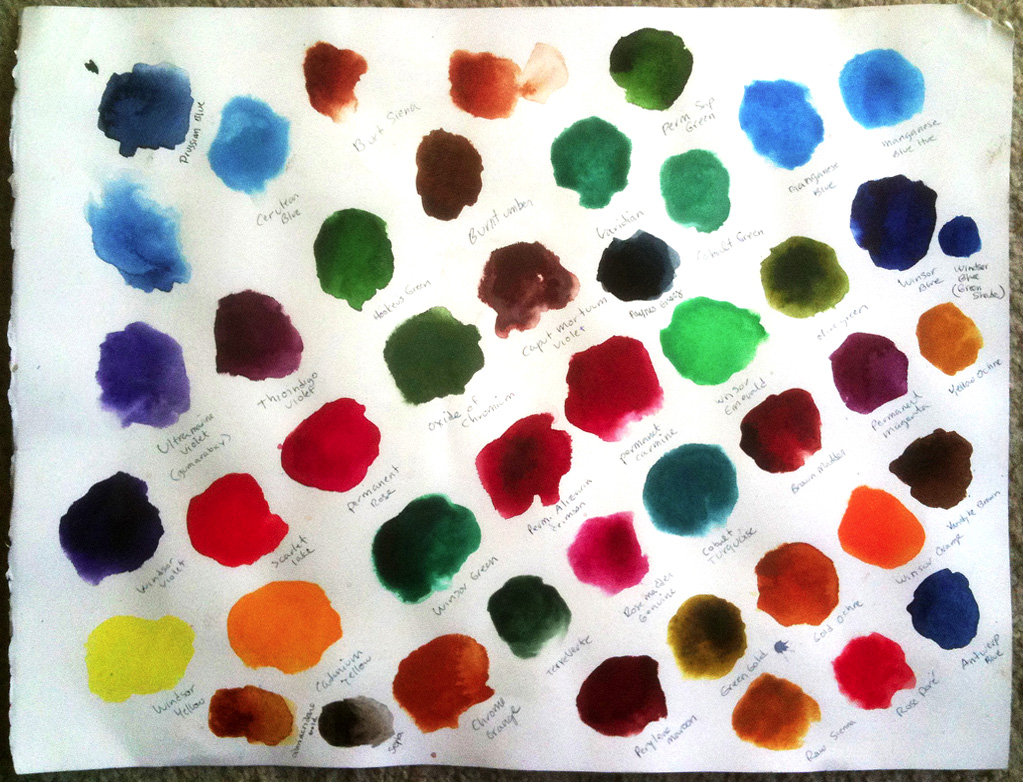
To create a palette that best fits your needs, I recommend using half a full sheet (22″ x 30″) of watercolor paper. I use Arches 140 lb. hot press. I like to create a small puddle of paint for each color, leaving room on the page to add additional colors later. I also leave space between each color on the sheet, and label each with its name.
After creating your color swatches, look closely at each color to determine which are warm and which are cool, which are opaque and which transparent. Decisions about which colors to use in your palette will come through experimentation. Now use the remaining half sheet of watercolor paper and mix different colors together to see which combinations best fit your needs.
My palette consists almost exclusively of cool, transparent colors. It’s not that I don’t use the colors red or yellow, but I use cool versions of red (leaning towards pink or purple instead of orange) and yellow (leaning towards green instead of orange). Even the blues I use are cool. For example, I stay away from Ultramarine Blue because it’s a warm blue. Choosing a cool palette allows more freedom with paint mixing. When blending colors, keep in mind that warm colors and cool colors generally don’t mix well. Scarlet Lake Red (warm) mixed with Manganese Blue (cool) makes mud, not purple. Some people use all warm colors on their palette, but to my eye, their finished paintings look hot.
I use Winsor & Newton paints (from the tube). Here are the colors that I use in my kit:
Permanent Magenta
Permanent Rose
Scarlet Lake Red (semi opaque)
Windsor Orange
Quinacridone Gold
Windsor Yellow
Green gold
Olive green
Hooker’s green
Permanent Sap Green
Cobalt Green
Cobalt Turquoise Light (semi opaque)
Prussian Blue
Manganese Blue Hue
Paynes Gray (semi opaque)
Windsor Violet
Vandyke Brown
Sepia (semi opaque)
Burnt Umber
With all of these beautiful, cool colors on my palette, I can freely mix and blend without making mud. I try to limit myself to two colors per cup but there are so many I love that I often squeeze in three.
I reserve Scarlet Lake, Cadmium Yellow, and Windsor Orange for isolated areas because they don’t mix well with the other colors. But I don’t want to leave them out since they add warmth and life to my paintings.
“Base” Colors
There are three colors I consider my “base”: Vandyke Brown, Paynes Gray, and Green Gold. Generally, I add these base colors to other colors to darken them or to give a color added depth.